To kickoff homecoming week, SEM unveiled a brand new logo. Whenever an organization updates their image, it's understandable that some people will have a negative reaction to the change. Since we have received a few questions about our new Mustang, we thought that it might help to share why we decided to make this change, how we arrived at the new design and why this is a step forward.
We first realized SEM might benefit from a new logo after looking through a pile of archived t-shirts. The ten shirts we reviewed used 7 different mustang logos. We believe that SEM is a special place and deserves a strong and consistent logo that people instantly recognize. We aren't the only high school using a Mustang as a mascot. There are several in Nebraska alone. We wanted a logo that was unique and would differentiate us from the herd.
The logo that was most commonly used by SEM (as seen on the old banners and the gym floor) is a free stock logo that is used by lots of schools around the country. Even though we have used it for a long time, it’s not "ours" and we can never own it. If you google “School Mustang Logo” you’ll find that our old logo is the top result. We wanted an original and unique design that our students, faculty, and communities could truly call their own. A logo that isn’t and can’t be used by any other school or organization.
When we made the decision to move forward with updating our logo, we created a committee consisting of students, teachers, coaches, community members, and school board members. We made sure that the volunteers selected represented the views from a wide variety of individuals. In early September, the committee met with a professional graphic designer (who generously agreed to donate their time and expertise). During this initial meeting, the group shared what they felt made SEM special and what they wanted to see in a new logo. The consensus was that the new Mustang should be unique, modern looking, aggressive and use bold lines. Based on these suggestions, the designer went to work building the first version of our new logo. After a few rounds of revisions, the committee was pleased with the results and it was taken to the school board for final approval on October 12th. The logo passed unanimously and the rest is history!
The discussions between the committee and their designer included the following:
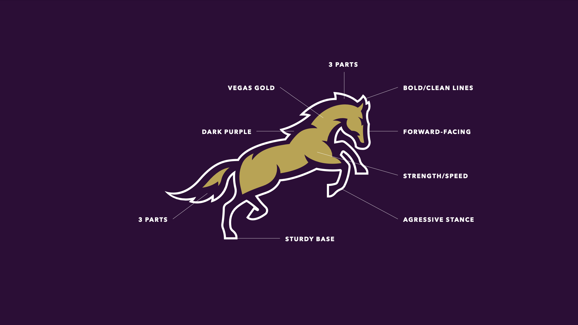
Color was discussed in great detail. Consensus was that the football uniforms which use "Vegas Gold" and dark purple instead of the traditional yellow made the school look more sophisticated. Specific color codes were included in the new design. Moving forward, all new uniforms, apparel and signage will be consistent, which will help build our brand and keep us looking sharp!
To represent the three different communities our school serves, both the tail and mane were designed with three distinct parts.
The committee wanted a mustang that was “moving forward” to the future.
Words like aggressive, bold, and speed were desired traits in the design.
The committee wanted to see something that was modern with bold lines that match the current design trends in collegiate and professional sports.